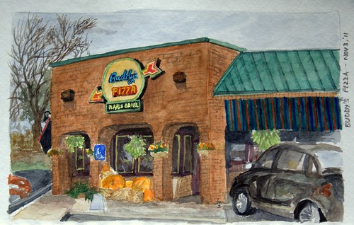
To continue with my Library Sketch, I had stepped out packing in all my plein air gear to go to the library, but didn't find the sunlight and the shadows.. The colors around don't seem the same on a cloudy day.. They look even more muted on a rainy day!
So last week, I headed to Buddy's Pizza instead, since I had been attracted by how the light on the sign shines in a gloomy day.
I have, for some time been trying to understand how you can reproduce the light effect of a neon sign; on a sunny day, the light hardly ever catches your eye!
Very recently, I had the chance of reading James Gurney's "Color and Light: A Guide for the Realist Painter", and that's where I discovered how you can show that. So I just went ahead and sketched this one. I think the book should be put in the artists painter's list of essentials.
Too bad, I composed the sketch wrongly. And the camera doesn't do much justice to the colors either!
Next time, I'll just draw the lights close up, rather than the entire building...!
So last week, I headed to Buddy's Pizza instead, since I had been attracted by how the light on the sign shines in a gloomy day.
I have, for some time been trying to understand how you can reproduce the light effect of a neon sign; on a sunny day, the light hardly ever catches your eye!
Very recently, I had the chance of reading James Gurney's "Color and Light: A Guide for the Realist Painter", and that's where I discovered how you can show that. So I just went ahead and sketched this one. I think the book should be put in the artists painter's list of essentials.
After painting it all, I took a photograph of the building from my car so that I could see what was different about the sign in the photograph versus what I painted.. I feel the sign came out better in the snap than the sketch though...
Too bad, I composed the sketch wrongly. And the camera doesn't do much justice to the colors either!
Next time, I'll just draw the lights close up, rather than the entire building...!


4 comments:
It's a great piece, even if you didn't quite accomplish what you were reaching for.
wow looks great!!
Interesting to see your source photo here Shalini for comparison. I really like your painting - it's a fairly faithful reproduction. The sign looks great.
One thing I've noticed about neon signs, is that in the dark and in low light, there is always a colour glow around them, bouncing off whatever background they are attached to.
Thank you all for visiting..
Thanks Frank.. I'll keep an eye open for that detail next time I try out painting a sign.. I could see what you mean while driving today...
Post a Comment